Raymond Devos the Maddest Reason
original title Raymond Devos, la raison du plus fou
client Le cherche midi • Fondation Raymond-Devos • 2012
project Design graphic and production
manufacturing 210 x 300 cm • 224 pages • bound
texts François Morel

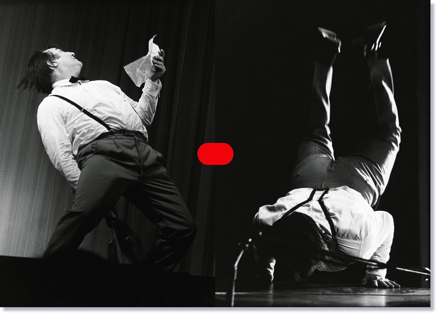
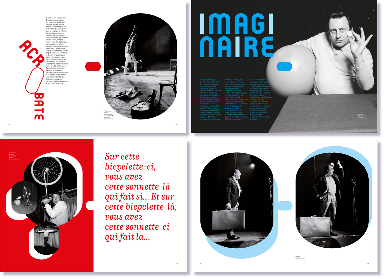
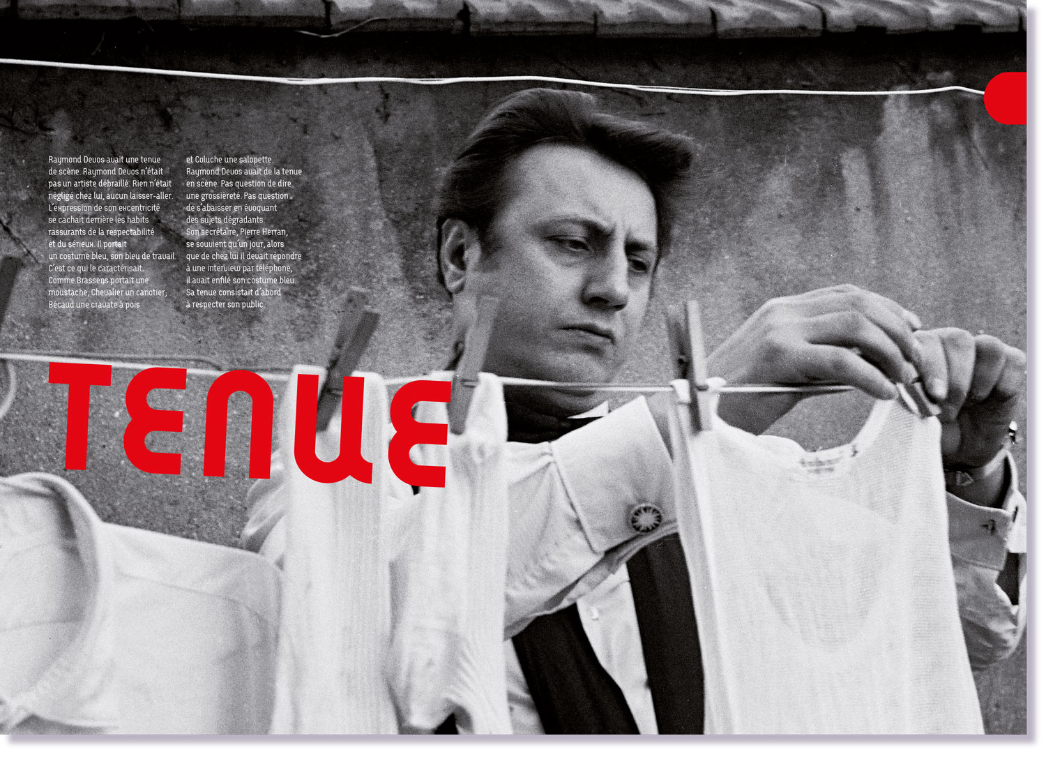
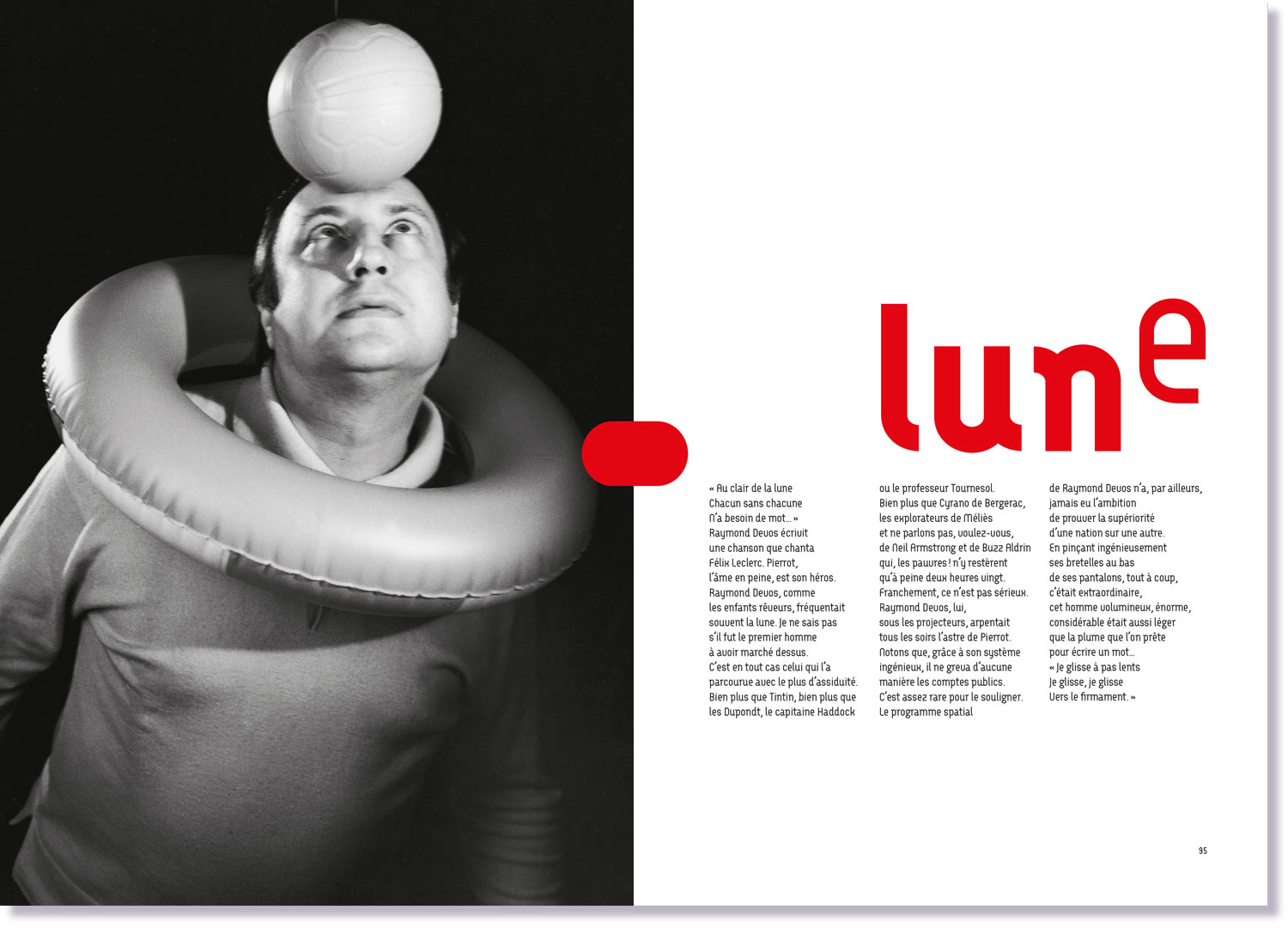
The rounded Arcus typeface evokes Raymond Devos, the very physical stage performer. This contrasts with the more classically styled italic CA normal serif, used for quotations and expressing the eminently literary and profound nature of his writing. Beyond the humor, there is gravity and immense poetry. This is also conveyed by the two colors used: red evokes the clown, blue the gentleness of the dreamer.